Learn about what the main dashboard reflects and the actions you can perform
-
The Digital Wallet dashboard provides you with an overview of the relevant stats that reflect how your business is doing.
-
To make it meaningful, displayed information is segregated into Visits, Activity, Retention, Feedback Rating, Referral Program, and Customer Profiles.
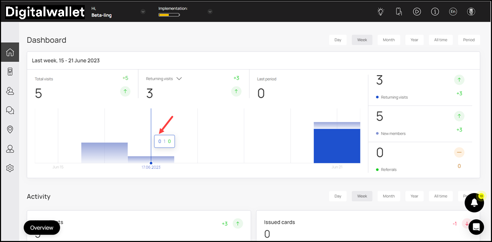
Visits
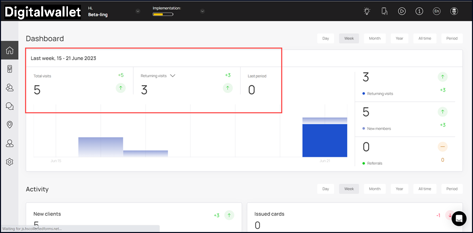
- Starting off, the Visits card is displayed. It includes weekly stats for the Total visits, Returning visits, and Last Period. A count for each of these is displayed at the top.
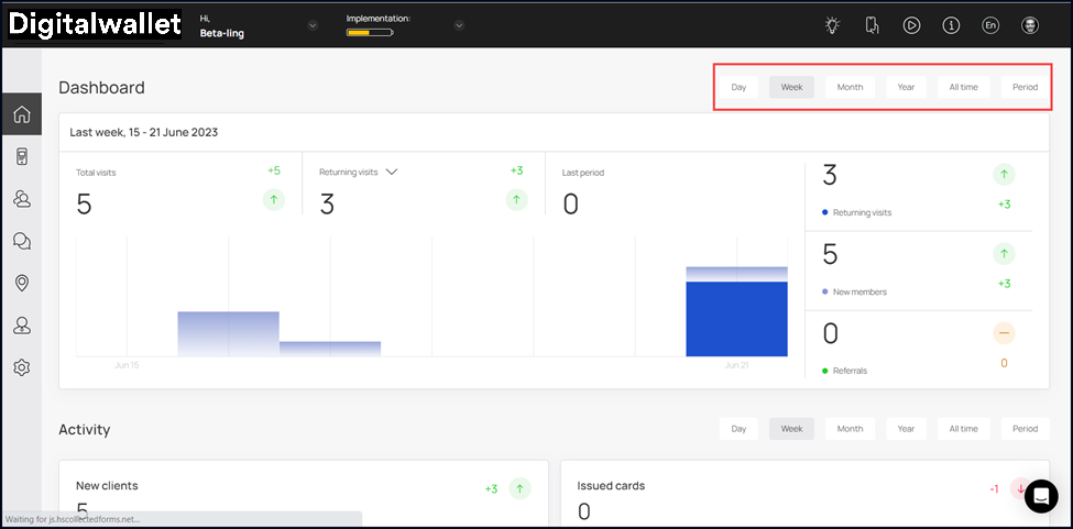
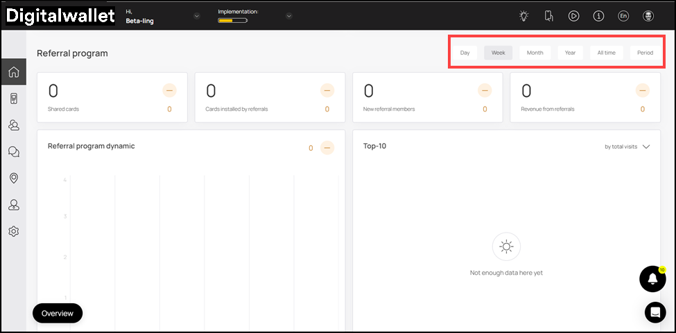
- By default, the time period is set to Week. However, you can change it to Day, Month, Year, All Time, and Period (Custom Range) using the action buttons on the top-right corner.
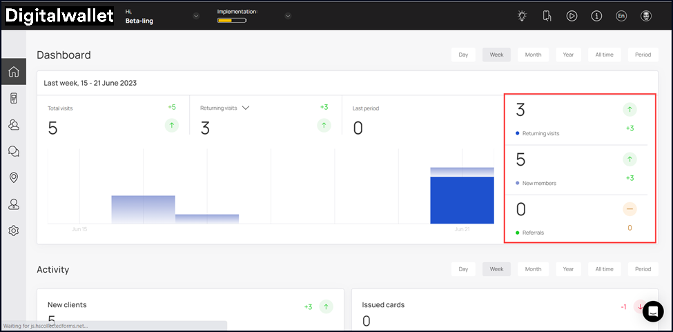
- On the right side of the graph are three more indicators that include Returning visits, New members, and Referrals. Each of these is displayed via a graphical representation at the center.
- Hovering over a bar reveals a tooltip displaying the count for each indicator for the selected date. Each stat in this tooltip is color-coded for easier identification.

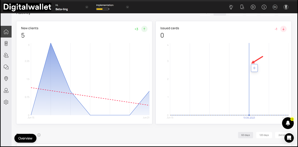
Activity
-
The Activity section includes a couple of graphs named New Clients and Issued Cards.
-
Displaying the activity stats for your business, the New Clients graph has the number of new clients on boarded via Digital Wallet against each day of the week.
- Hovering over a date displays a tooltip displaying the number of new clients registered on the app on the specific date.
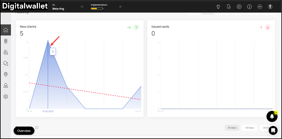
- Similarly, Issued Cards is a graph that has the number of issued cards mapped against each day of the week.
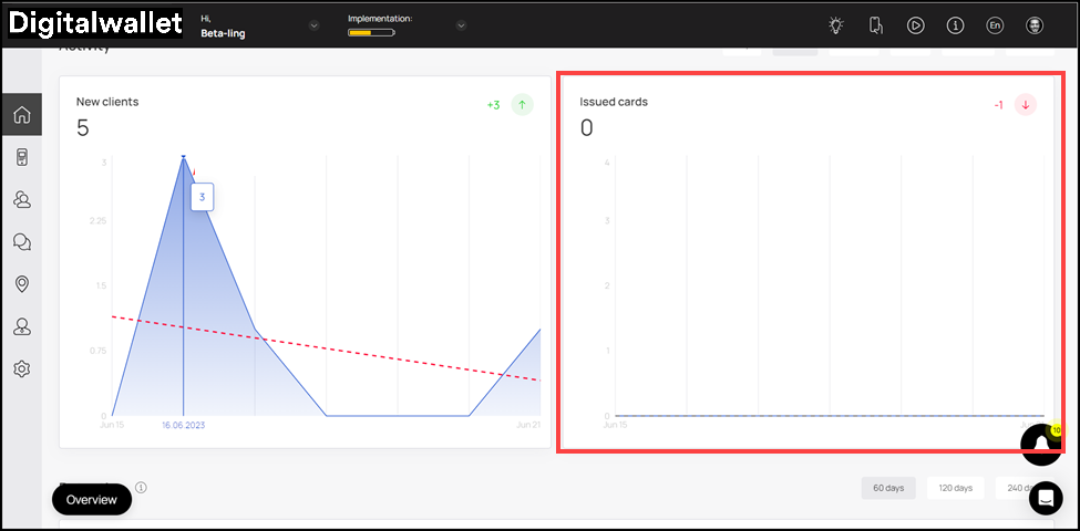
- Hovering over a date reveals a tooltip displaying the number of cards issued on that specific date.
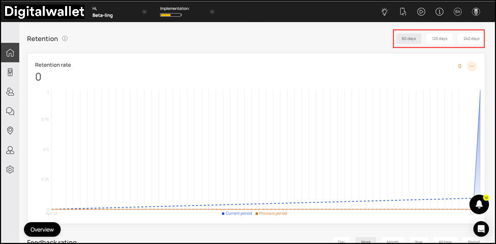
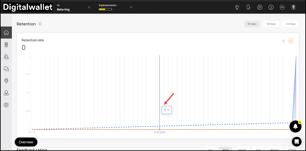
Retention
- This section includes the Retention Rate graph. In this graph, the retention rate of the customers is mapped against a time period of 60, 120, and 240 days.
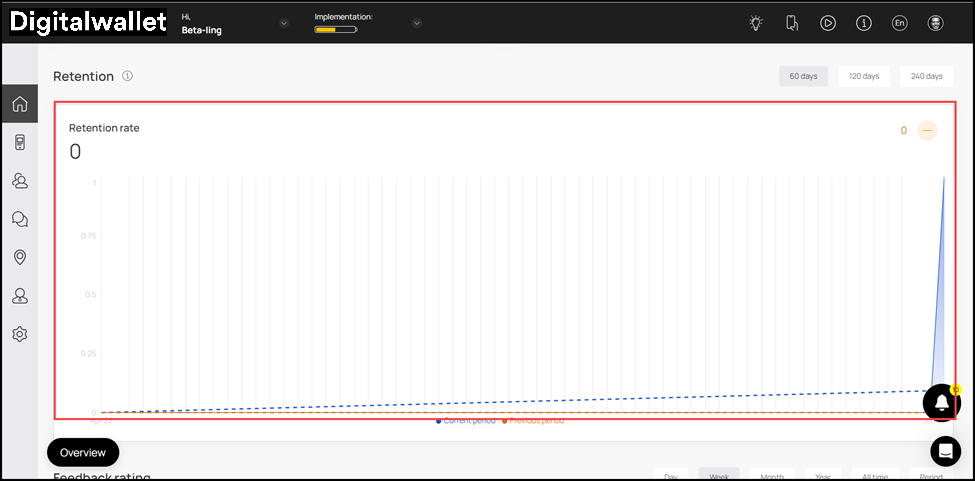
- By default, retention rate for 60 days is displayed. However, you can change it to 120 and 240 using the action buttons at the top-right corner.
- Moreover, hovering over a bar reveals a tooltip displaying the retention rate for the current period and previous period on the specific date. The retention rate for the current period is displayed in blue-color whereas the orange color is used to represent the retention rate for the previous period.
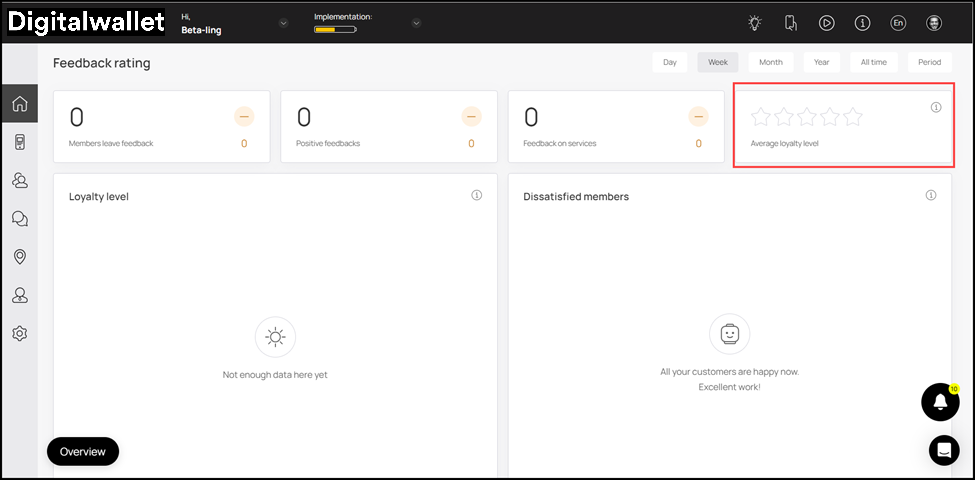
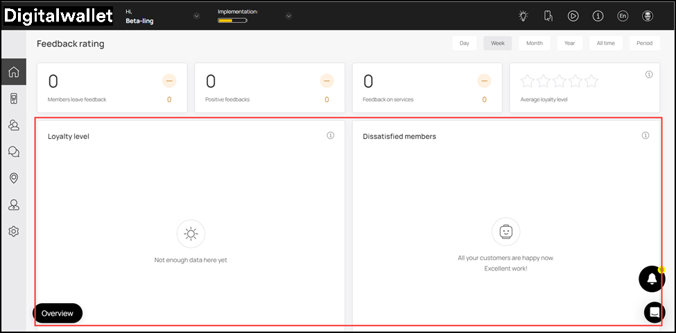
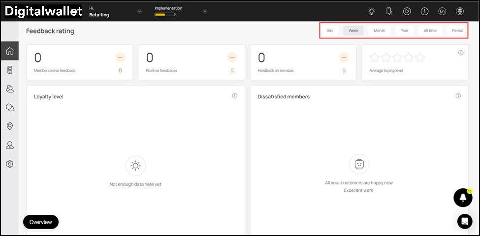
Feedback Rating
-
This section includes a number of tiles to represent the satisfaction level of your customers.
-
It starts off with a count each for the members who left feedback, Positive Feedbacks, and Reviews on Cards during the selected time period displayed via individual tiles.
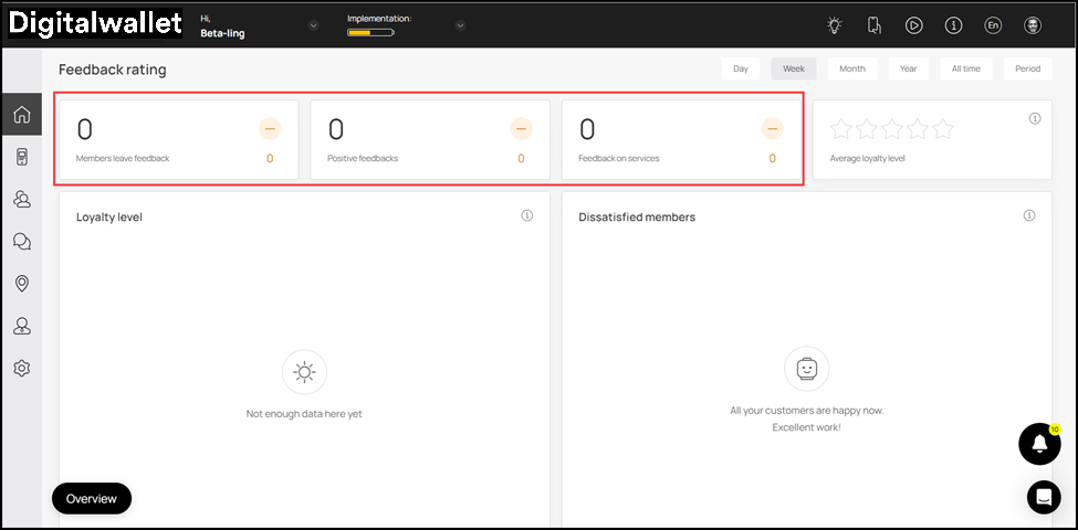
- This is followed by the Average Loyalty Level tile that represents the loyalty level of the customers via a star rating.
- Towards the end of this section are a couple of graphs that display the Loyalty Level and Dissatisfied members during the selected time duration.
- By default, Week is selected as the time duration. However, you can change it to Day, Month, Year, All Time, and Period (Custom Range) using the action buttons at the top-right corner.
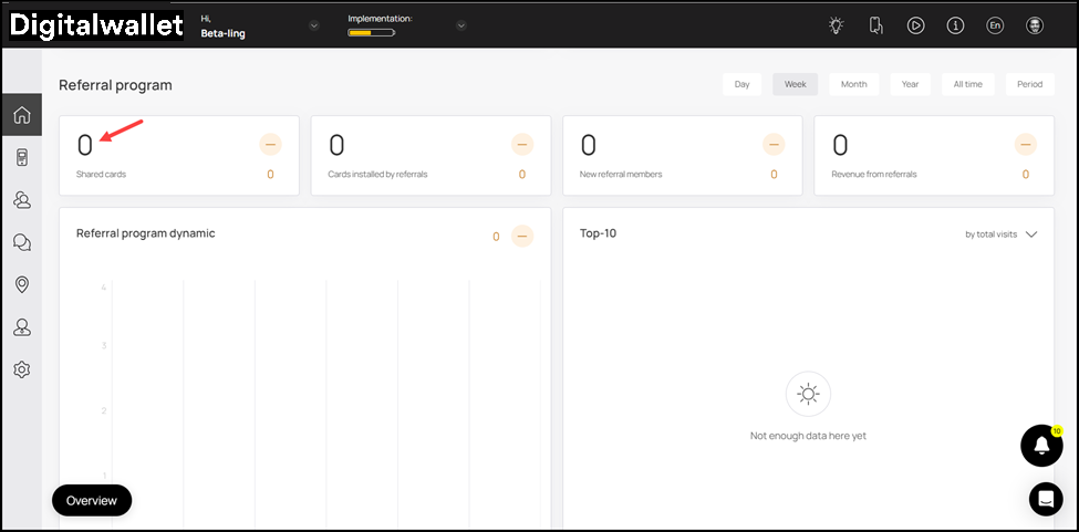
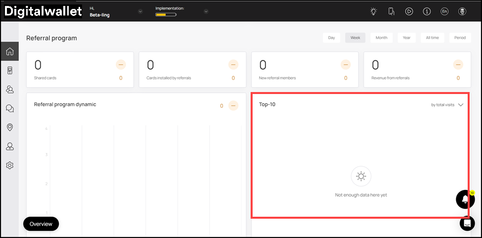
Referral Program
-
To start off, the Shared Cards tile displays the count of cards shared by the customers as referral during the selected timeframe.
-
As the name says, this section includes all the stats relevant to the referral program offered by your business.
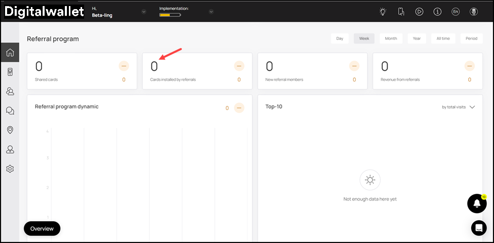
- Similarly, Cards installed by referrals tile displays the count of cards installed by customers via a referral.
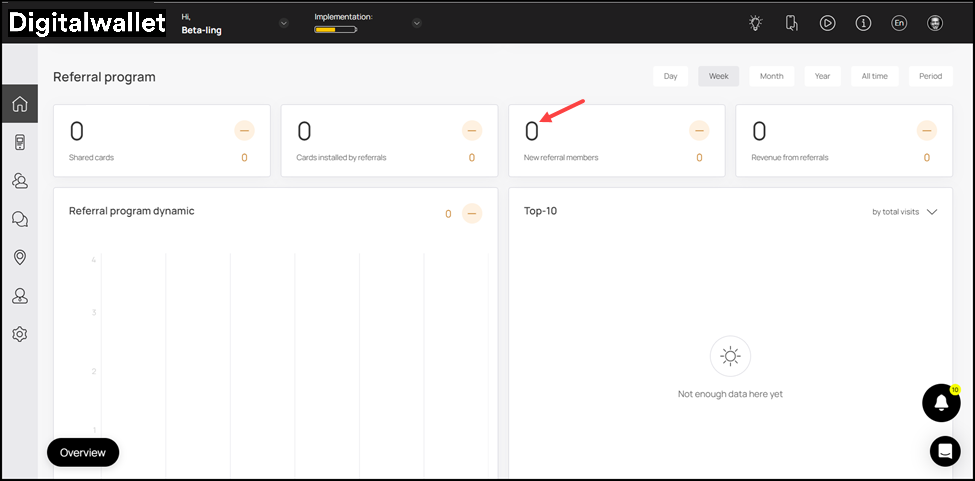
- New Referral Members tile displays the count of the members that have been on boarded via referrals during the defined time period.
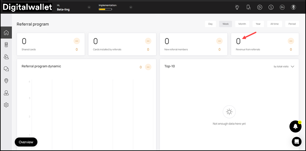
- Revenue from Referrals tile shows the amount in revenue generated from the referrals.
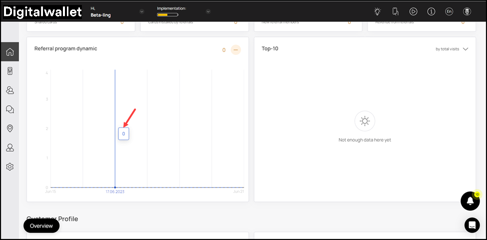
- This is followed by the Referral Program Dynamic graph which maps the performance of the referral program against each day of the week.
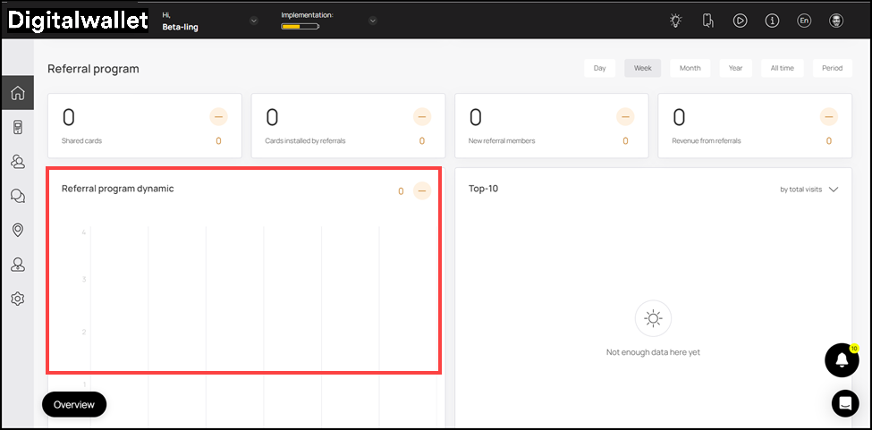
- Hovering over a bar reveals a tooltip displaying the referral program performance on the specific date.
- Towards the end is the New Referral Members graph. This maps the number of new referral members against each date of the week.
- By default, the time period is set to Week. However, you can change it to Day, Month, Year, All Time, and Period (Custom Range) using the action buttons at the top-right corner.
Customer Profile
-
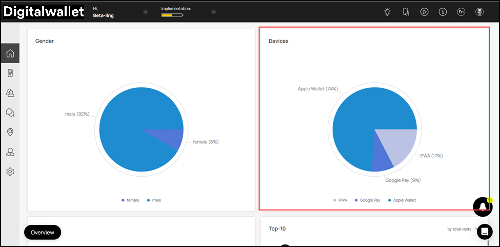
This section provides insights into existing customer profiles for your business.
-
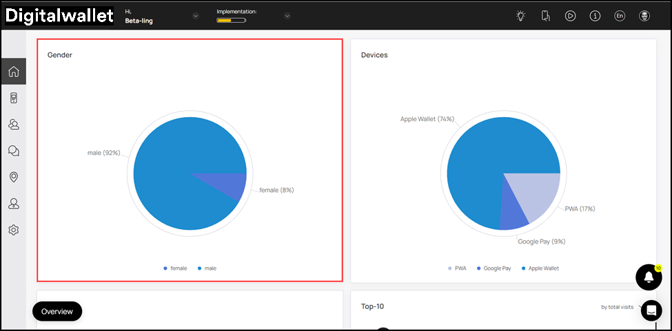
Starting from the Gender pie chart, it displays a segregation of the customer profiles w.r.t their gender.
- Moving forward, the Devices pie chart displays a segregation of customer profiles w.r.t the devices they used for add loyalty cards.
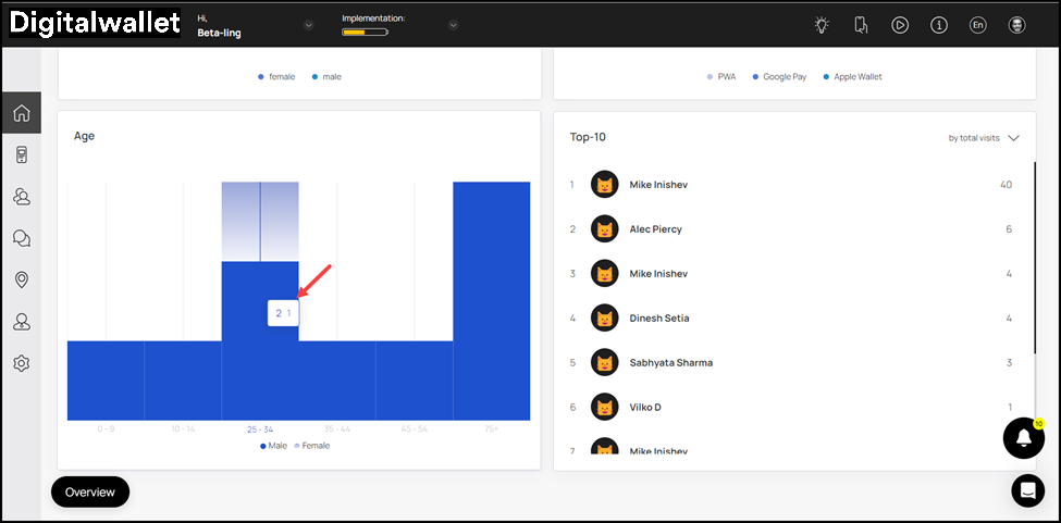
- This is followed by the Age graph that displays the customer profiles falling in each age range with an separate color to reflect gender.
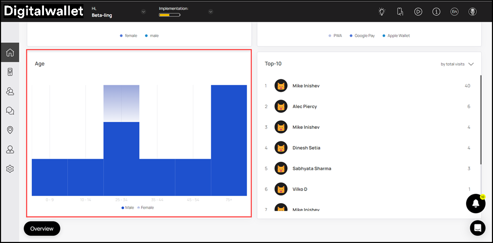
- Hovering over the age range bar reveals a tooltip displaying the number of customer profiles in each gender.